3.2 テーマのレイアウト設計
このページでは、index.phpとstyle.cssの編集を行い、ブログ全体の枠組みを作成していきます。
目次
******************************
3.2.1 index.phpとstyle.cssでのフレーム設定
3.2.2 style.cssでの文字、レイアウトの設定
3.2.3 style.cssでのレスポンシブ化
******************************
3.2.1 index.phpとstyle.cssでのフレーム設定
はじめに、index.phpで各HTML要素を作成し、container、sidebar等の属性を指定していきます。
<!DOCTYPE html>
<html>
<head>
<link rel="stylesheet" href="<?php echo get_stylesheet_uri(); ?>" type="text/css" media="screen" />
</head>
<body>
  <div id="container">
    <header>
    </header>
    <div id="main">
      <div id="content">
      </div><!--#content-->
      <div id="sidebar">
      </div>
      <div class="clear"></div>
    </div><!--#main-->
    <footer>
    </footer>
  </div><!--#container-->
</body>
</html>
次に、style.cssを編集し、index.phpで作成した各要素に対して、width、margin、float等のプロパティを用いて、大きさ、配置、間隔等を指定していきます。
/*
Theme Name: tsuredure-diary
Theme URL: https://tsuredure-diary.info/
Author: ken
Version: 1.0
*/

/* General */
body {
  background-color: #fff;
}

#container {
  width: 960px;
  margin: 0 auto;
  padding: 0;
}

header {
}

#main {
  margin-top: 3em;
  border: none;
}

#content {
  width: 690px;
  float: right;
  margin: 8px 0px 10px 30px;
  padding: 0;
}

#sidebar {
  width: 210px;
  float: left;
  margin: 15px 30px 10px 0px;
  padding: 0;
}

footer {
  text-align: center;
}

.clear {
  clear:both;
}
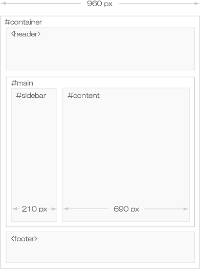
基本的に、大枠の横幅を指定し、marginやpaddingを使用して、各要素の間隔を調整しています。
レスポンシブに対応するため、なるべくpxでの指定は避け、remやemでの指定を心がけましょう。
今回指定した各要素を図にすると以下のようになります。
3.2.2 style.cssでの文字、レイアウトの設定
前項に引き続き、index.phpを編集して、ブログのタイトル、説明、本文等の詳細な要素を作成していきます。
※ はじめのサイトのデザインの決定で、デザインを詳細に詰めておくと、このあたりのコーディングはスムーズに進みます。
<!DOCTYPE html>
<html>
<head>
<link rel="stylesheet" href="<?php echo get_stylesheet_uri(); ?>" type="text/css" media="screen" />
</head>
<body>
  <div id="container">
    <header>
      <div id="site-title-wrapper">
       <div id="site-title">ブログのタイトル</div>
       <div id="site-description">ブログの説明</div>
      </div>
      <div id="nav">
        <ul id="main_nav">
          <li>ページ</li>
          <li>ホーム</li>
        </ul>
        <div class="clear"></div>
      </div>
    </header>
    <div id="main">
      <div id="content">
        <article class="post">
          <h1>タイトル</h1>
          <p class="post_meta">メタ情報</p>
          <div class="clear"></div>
          <div class="post_content">ブログ本文
          </div>
        </article>
      <!-- pagination -->
        <div class="pagination">
          <div class="pagination_pre">前のページ</div>
          <div class="pagination_next">次のページ</div>
        </div>
        <div class="clear"></div>
      <!-- /pagination -->
      </div><!--#content-->
      <div id="sidebar">サイドバー
      </div>
      <div class="clear"></div>
    </div><!--#main-->
    <footer>
      <p>©ブログのタイトル</p>
    </footer>
  </div><!--#container-->
</body>
</html>
次に、index.phpで作成した各要素に、文字色、行間、文字間隔、各要素の配色等、詳細なスタイルを指定していきます。
/*
Theme Name: tsuredure-diary
Theme URL: https://tsuredure-diary.info/
Author: ken
Version: 1.0
*/

/*---------------------------------------------------------*/
/* General */
/*---------------------------------------------------------*/
body {
  font-family: 'Lucida Grande', YuGothic, 'Hiragino Kaku Gothic ProN', Meiryo, sans-serif;
  font-size: 14px;
  color: #585858;
  background-color: #fff;
}

a {
  color: #585858;
  text-decoration: none;
  border-bottom: 1px solid #e6e6e6;
}

a:hover {
  color: #a4a4a4;
  border-bottom: none;
}

p {
  font-size: 1.0em;
  line-height: 2.0em;
  letter-spacing: 0.05em;
  color: #585858;
  margin: 1.0em 0px;
}

h1 {
  font-size: 1.4em;
  letter-spacing: 0.02em;
  color: #585858;
  border-bottom: 2px solid #e6e6e6;
  margin: 0.2em 0 0.2em 0;
  padding-left: 0.4em;
}

h1 a {
  border-bottom: none;
}

h2 {
  font-size: 1.2em;
  letter-spacing: 0.03em;
  color: #585858;
  border-left: 0.5em solid #e6e6e6;
  border-bottom: 1px solid #e6e6e6;
  margin: 4.0em 0 1.5em 0;
  padding-top: 0.2em;
  padding-left: 0.7em;
}

ul {
  list-style: none;
  margin: 0;
  padding: 0;
}

img {
  max-width: 100%;
  height: auto;
}

a img {
  border: none;
}

img.alignleft {
  display: block;
  margin: auto 0 0 0;
}

img.aligncenter {
  display: block;
  margin: 0 auto;
}

img.alignright {
  display: block;
  margin: 0 0 0 auto;
}

img.alignnone {
}

#container {
  margin: 0 auto;
  width: 960px;
  padding: 0;
}

header {
}

#main {
  margin-top: 3em;
  border: none;
}

#content {
  width: 690px;
  float: right;
  padding: 0;
  margin: 8px 0px 10px 30px;
}

#sidebar {
  width: 210px;
  float: left;
  padding: 0;
  margin: 15px 30px 10px 0px;
}

.clear {
  clear:both;
}

/*---------------------------------------------------------*/
/* Header */
/*---------------------------------------------------------*/
#site-title {
  text-align: center;
  font-size: 2.7em;
  letter-spacing: 0.2em;
  margin: 30px 0 5px 0;
  color:#585858;
}

#site-title a {
  color: #585858;
  border-bottom: none;
}

#site-description {
  text-align: center;
  font-size: 1.0em;
  letter-spacing: 0.4em;
  color: #585858;
  margin: 0 0 0.1em 0;
}

#nav {
  margin-bottom: 2.0em;
}

ul#main_nav {
  overflow: hidden;
}

ul#main_nav li {
  float: right;
}

ul#main_nav li a {
  font-size: 1.0em;
  display: block;
  width: 7.0em;
  color: #585858;
  text-align: center;
  margin: 1.1em 0.2em 0 0.2em;
  padding: 0.42em 0.2em 0.34em 0.2em;
  border-radius: 0.3em;
  border-bottom: none;
}

ul#main_nav li a:hover {
  background-color: #f2f2f2;
  color: #a4a4a4;
}

.sub-menu {
  display: none;
}

.menu-item-has-children:hover .sub-menu {
  display: block;
}

/*---------------------------------------------------------*/
/* Content
/*---------------------------------------------------------*/
p.post_meta {
  color: #585858;
  font-size: 1em;
  margin: 0.0em 0.8em 0.0em 0.8em;
  float: left;
}

p.post_meta a {
  color: #585858;
  text-decoration: none;
  border-bottom: none;
}

p.post_meta a:hover {
  color: #a4a4a4;
  text-decoration: none;
  border-bottom: none;
}

article.post {
  margin-bottom: 5.0em;
}

.post_content {
  margin: 2.5em 0.8em 2.0em 0.8em;
}

.pagination {
  margin: 4.0em 1.0em;
}

.pagination .pagination_next {
  float: right;
}

.pagination .pagination_pre {
  float: left;
}

pre {
  padding: 1.0em;
  border: 1px solid #e6e6e6;
  width: auto;
  overflow-x: auto;
  color: #585858;
  background-color: rgba(230,230,230,0.3);
}

/* Comments */
#comm_wrapper {
  margin: 5.0em 1.0em 2.0em 1.0em;
}

.comm_list {
}

.comm_form {
  margin: 3.0em 0 0 0;
}

ol.comm {
  list-style:none;
}

#respond label{
  display:block;
}

#respond input, #respond textarea{
  color: #585858;
  width: 50%;
  background-color: rgba(255,255,255,0);
}

.comment-form-url {
  display: none;
}

#respond input[type="submit"]{
  width: auto;
  background-color: rgba(255,255,255,0);
}

.comment-notes {
  display: none;
}

.says {
  display: none;
}

.comment-form-cookies-consent {
  display: none;
}

/*---------------------------------------------------------*/
/* Sidebar */
/*---------------------------------------------------------*/
.widget-wrapper {
  margin-bottom: 3.0em;
  padding: 0;
}

.widget-wrapper li {
  font-size: 1.0em;
  letter-spacing: 0.03em;
  color: #585858;
  margin: 0.6em 0;
}

.widget-wrapper h4 {
  font-size: 1.0em;
  color: #585858;
  margin-bottom: 0;
}

/* Calendar */
table#wp-calendar {
  font-size: 1.0em;
  color: #585858;
  text-align: center;
}

table#wp-calendar caption {
  letter-spacing: 0.2em;
  margin-bottom: 0.5em;
}

table#wp-calendar tfoot a {
  color: #585858;
  text-decoration: none;
  border-bottom: none;
}

table#wp-calendar tfoot a:hover {
  color: #a4a4a4;
  text-decoration: none;
  border-bottom: none;
}

table#wp-calendar td {
  height: 1.0em;
  width: 1.8em;
}

table#wp-calendar #today {
  font-weight: bold;
}

table#wp-calendar tbody a {
  display: block;
  width: 1.8em;
  height: 1.45em;
  color: #585858;
  background-color: #e6e6e6;
}

table#wp-calendar tbody a:hover {
  display: block;
  width: 1.8em;
  height: 1.45em;
  color: #a4a4a4;
  background-color: #f2f2f2;
  border-bottom: 1px solid #f2f2f2;
}

/*---------------------------------------------------------*/
/* Footer */
/*---------------------------------------------------------*/
footer {
  font-size: 0.9em;
  text-align: center;
}
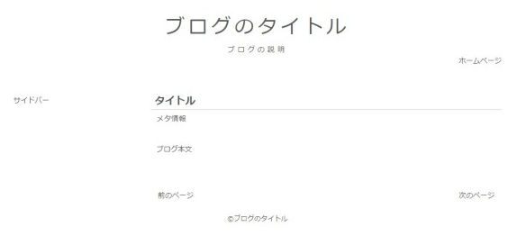
このスタイルシートでは、bodyでフォントを14pxと指定し、emで文字や要素間を指定しています。相対的に大きさを指定しておくことで、レスポンシブ化する際、シンプルに対応することができます。
※ このスタイルシートには、解説の都合上、これ以降に述べる各テンプレートのレイアウト指定も含まれています。
これまでのスタイルを適用させると、以下のようなブラウザでの表示になります。
3.2.3 style.cssでのレスポンシブ化
サイトをレスポンシブ化する際、いくつかの方法がありますが、最も一般的な方法はviweportとメディアクエリ(@media)を使用することです。
viweportとは、サイトをどのように表示させるかを指定できるmeta要素で、これによりサイトの表示サイズや、初期倍率などの指定を行うことができます
また、メディアクエリとは、スタイルシートを切り替えることができる機能で、ブラウザのウィンドウ幅を調べることにより、これを利用したスタイルシートの振り分けを行うことができます。
この項では、index.phpでviewportの設定をして、style.cssでメディアクエリによる振り分け設定を行います。
まず、index.phpの
タグ内に以下のmeta要素を記述します。<meta name=viewport content="width=device-width, initial-scale=1.0">
ブラウザ表示が、横幅画面いっぱい、初期倍率が1倍になるように指定しています。
※ この指定がないと、デバイスによっては、サイト全体が縮小表示されてしまう可能性もあるため注意が必要です。
次に、style.cssでメディアクエリを指定するため、以下の記述を書き加えます。
@media screen and (max-width: 960px) {
body {
  font-size: 12px;
}

#container {
  width: 98%;
}

#main {
  width: 100%;
  margin-top:2.0em;
}

#content {
  width: 100%;
  margin: 0;
}

#sidebar {
  width: 100%;
  margin: 5.0em 2% 0.0em 2%;
}

/* Comments */
#respond input, #respond textarea{
  width: 80%;
}
}
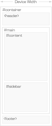
@media で max-width: 960pxと指定することで、ブラウザウィンドウ幅が960px以下の場合に読み込まれるスタイルを指定しています。また、ここに指定していないスタイルは、すでに記述されているスタイルから、上から順に読み込まれるようになっています。(960pxは便宜上の値です。)
これまでの指定により、ブラウザのウィンドウ幅が960px以下で表示した際の、各要素のレイアウトは以下のようになります。
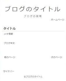
以下はブラウザでの表示です。
スタイルシートの編集は、なるべくemなどの相対指定を用い、シンプルに組むよう心がけましょう。
これまでのindex.php、style.cssの編集をまとめると以下のようになります。
index.php
<!DOCTYPE html>
<html>
<head>
<meta name=viewport content="width=device-width, initial-scale=1.0">
<link rel="stylesheet" href="<?php echo get_stylesheet_uri(); ?>" type="text/css" media="screen" />
</head>
<body>
  <div id="container">
    <header>
      <div id="site-title-wrapper">
       <div id="site-title">ブログのタイトル</div>
       <div id="site-description">ブログの説明</div>
      </div>
      <div id="nav">
        <ul id="main_nav">
          <li>ページ</li>
          <li>ホーム</li>
        </ul>
        <div class="clear"></div>
      </div>
    </header>
    <div id="main">
      <div id="content">
        <article class="post">
          <h1>タイトル</h1>
          <p class="post_meta">メタ情報</p>
          <div class="clear"></div>
          <div class="post_content">ブログ本文
          </div>
        </article>
      <!-- pagination -->
        <div class="pagination">
          <div class="pagination_pre">前のページ</div>
          <div class="pagination_next">次のページ</div>
        </div>
        <div class="clear"></div>
      <!-- /pagination -->
      </div><!--#content-->
      <div id="sidebar">サイドバー
      </div>
      <div class="clear"></div>
    </div><!--#main-->
    <footer>
      <p>©ブログのタイトル</p>
    </footer>
  </div><!--#container-->
</body>
</html>
style.css
/*
Theme Name: tsuredure-diary
Theme URL: https://tsuredure-diary.info/
Author: ken
Version: 1.0
*/

/*---------------------------------------------------------*/
/* General */
/*---------------------------------------------------------*/
body {
  font-family: 'Lucida Grande', YuGothic, 'Hiragino Kaku Gothic ProN', Meiryo, sans-serif;
  font-size: 14px;
  color: #585858;
  background-color: #fff;
}

a {
  color: #585858;
  text-decoration: none;
  border-bottom: 1px solid #e6e6e6;
}

a:hover {
  color: #a4a4a4;
  border-bottom: none;
}

p {
  font-size: 1.0em;
  line-height: 2.0em;
  letter-spacing: 0.05em;
  color: #585858;
  margin: 1.0em 0px;
}

h1 {
  font-size: 1.4em;
  letter-spacing: 0.02em;
  color: #585858;
  border-bottom: 2px solid #e6e6e6;
  margin: 0.2em 0 0.2em 0;
  padding-left: 0.4em;
}

h1 a {
  border-bottom: none;
}

h2 {
  font-size: 1.2em;
  letter-spacing: 0.03em;
  color: #585858;
  border-left: 0.5em solid #e6e6e6;
  border-bottom: 1px solid #e6e6e6;
  margin: 4.0em 0 1.5em 0;
  padding-top: 0.2em;
  padding-left: 0.7em;
}

ul {
  list-style: none;
  margin: 0;
  padding: 0;
}

img {
  max-width: 100%;
  height: auto;
}

a img {
  border: none;
}

img.alignleft {
  display: block;
  margin: auto 0 0 0;
}

img.aligncenter {
  display: block;
  margin: 0 auto;
}

img.alignright {
  display: block;
  margin: 0 0 0 auto;
}

img.alignnone {
}

#container {
  margin: 0 auto;
  width: 960px;
  padding: 0;
}

header {
}

#main {
  margin-top: 3em;
  border: none;
}

#content {
  width: 690px;
  float: right;
  padding: 0;
  margin: 8px 0px 10px 30px;
}

#sidebar {
  width: 210px;
  float: left;
  padding: 0;
  margin: 15px 30px 10px 0px;
}

.clear {
  clear:both;
}

/*---------------------------------------------------------*/
/* Header */
/*---------------------------------------------------------*/
#site-title {
  text-align: center;
  font-size: 2.7em;
  letter-spacing: 0.2em;
  margin: 30px 0 5px 0;
  color:#585858;
}

#site-title a {
  color: #585858;
  border-bottom: none;
}

#site-description {
  text-align: center;
  font-size: 1.0em;
  letter-spacing: 0.4em;
  color: #585858;
  margin: 0 0 0.1em 0;
}

#nav {
  margin-bottom: 2.0em;
}

ul#main_nav {
  overflow: hidden;
}

ul#main_nav li {
  float: right;
}

ul#main_nav li a {
  font-size: 1.0em;
  display: block;
  width: 7.0em;
  color: #585858;
  text-align: center;
  margin: 1.1em 0.2em 0 0.2em;
  padding: 0.42em 0.2em 0.34em 0.2em;
  border-radius: 0.3em;
  border-bottom: none;
}

ul#main_nav li a:hover {
  background-color: #f2f2f2;
  color: #a4a4a4;
}

.sub-menu {
  display: none;
}

.menu-item-has-children:hover .sub-menu {
  display: block;
}

/*---------------------------------------------------------*/
/* Content
/*---------------------------------------------------------*/
p.post_meta {
  color: #585858;
  font-size: 1em;
  margin: 0.0em 0.8em 0.0em 0.8em;
  float: left;
}

p.post_meta a {
  color: #585858;
  text-decoration: none;
  border-bottom: none;
}

p.post_meta a:hover {
  color: #a4a4a4;
  text-decoration: none;
  border-bottom: none;
}

article.post {
  margin-bottom: 5.0em;
}

.post_content {
  margin: 2.5em 0.8em 2.0em 0.8em;
}

.pagination {
  margin: 4.0em 1.0em;
}

.pagination .pagination_next {
  float: right;
}

.pagination .pagination_pre {
  float: left;
}

pre {
  padding: 1.0em;
  border: 1px solid #e6e6e6;
  width: auto;
  overflow-x: auto;
  color: #585858;
  background-color: rgba(230,230,230,0.3);
}

/* Comments */
#comm_wrapper {
  margin: 5.0em 1.0em 2.0em 1.0em;
}

.comm_list {
}

.comm_form {
  margin: 3.0em 0 0 0;
}

ol.comm {
  list-style:none;
}

#respond label{
  display:block;
}

#respond input, #respond textarea{
  color: #585858;
  width: 50%;
  background-color: rgba(255,255,255,0);
}

.comment-form-url {
  display: none;
}

#respond input[type="submit"]{
  width: auto;
  background-color: rgba(255,255,255,0);
}

.comment-notes {
  display: none;
}

.says {
  display: none;
}

.comment-form-cookies-consent {
  display: none;
}

/*---------------------------------------------------------*/
/* Sidebar */
/*---------------------------------------------------------*/
.widget-wrapper {
  margin-bottom: 3.0em;
  padding: 0;
}

.widget-wrapper li {
  font-size: 1.0em;
  letter-spacing: 0.03em;
  color: #585858;
  margin: 0.6em 0;
}

.widget-wrapper h4 {
  font-size: 1.0em;
  color: #585858;
  margin-bottom: 0;
}

/* Calendar */
table#wp-calendar {
  font-size: 1.0em;
  color: #585858;
  text-align: center;
}

table#wp-calendar caption {
  letter-spacing: 0.2em;
  margin-bottom: 0.5em;
}

table#wp-calendar tfoot a {
  color: #585858;
  text-decoration: none;
  border-bottom: none;
}

table#wp-calendar tfoot a:hover {
  color: #a4a4a4;
  text-decoration: none;
  border-bottom: none;
}

table#wp-calendar td {
  height: 1.0em;
  width: 1.8em;
}

table#wp-calendar #today {
  font-weight: bold;
}

table#wp-calendar tbody a {
  display: block;
  width: 1.8em;
  height: 1.45em;
  color: #585858;
  background-color: #e6e6e6;
}

table#wp-calendar tbody a:hover {
  display: block;
  width: 1.8em;
  height: 1.45em;
  color: #a4a4a4;
  background-color: #f2f2f2;
  border-bottom: 1px solid #f2f2f2;
}

/*---------------------------------------------------------*/
/* Footer */
/*---------------------------------------------------------*/
footer {
  font-size: 0.9em;
  text-align: center;
}

@media screen and (max-width: 960px) {
body {
  font-size: 12px;
}

#container {
  width: 98%;
}

#main {
  width: 100%;
  margin-top:2.0em;
}

#content {
  width: 100%;
  margin: 0;
}

#sidebar {
  width: 100%;
  margin: 5.0em 2% 0.0em 2%;
}

/* Comments */
#respond input, #respond textarea{
  width: 80%;
}
}
スポンサーリンク
コメント欄